Top 10 Fonts That Will Elevate Your Web Design
When it comes to web design, font choice plays a crucial role in determining the overall aesthetic and user experience. Styles can differ drastically, and using the right fonts can significantly enhance your site's appeal. Here is a curated list of the top 10 fonts that will elevate your web design:
- Montserrat: A modern, geometric sans-serif typeface that is perfect for headers and logos.
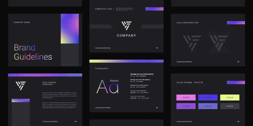
- Roboto: Known for its versatility and readability, this font works well for both body text and interface elements.
- Lora: A timeless serif font that adds a touch of elegance, making it ideal for blogs and articles.
- Open Sans: This humanist sans-serif font offers excellent legibility and slightly rounded letters, providing a friendly appearance.
- Slabo 27px: Tailored for high-quality typography, it performs exceptionally well for large text sizes.
- Raleway: A stylish font that is perfect for headings and provides a sophisticated feel.
- Playfair Display: A classic serif font that adds sophistication and charm, great for editorial sites.
- Poppins: Known for its geometric design, this font is visually appealing and modern.
- Nunito: A well-balanced sans-serif typeface that offers a friendly, rounded appearance.
- Oswald: A reworking of the classic gothic type style, this font gives a bold impact perfect for titles.
How to Choose the Perfect Typography for Your Brand
Choosing the perfect typography for your brand is essential, as it plays a significant role in communicating your identity to your audience. Start by understanding the personality of your brand. Is it playful, formal, modern, or classic? Once you've nailed down the essence of your brand, consider the following factors:
- Readability: Always prioritize fonts that are easy to read across various platforms.
- Versatility: Select typefaces that can adapt to different contexts, such as print and digital media.
- Brand Alignment: Ensure your typography feels authentic to your brand's story and message.
After identifying potential fonts, it's time to test them in real-world applications. Create mockups of your branding materials, like business cards or website headers, using your chosen typographic styles. This will help you visualize how different typefaces work together and how they resonate with your target audience. Remember, consistency is key, so limit your selection to two or three complementary fonts to maintain a cohesive look across all your branding efforts. By carefully considering typography, you'll create a strong visual identity that enhances your brand's message and appeal.
The Impact of Typography on User Experience: What You Need to Know
Typography plays a crucial role in shaping user experience on websites and applications. The selection of fonts, sizes, and spacing can significantly impact how users perceive and interact with content. For instance, a well-chosen font can enhance readability and create a sense of alignment with the brand's identity, while a poor choice can lead to user frustration and a high bounce rate. To optimize your site's user experience, consider the following aspects:
- Readability: Ensure that your text is easy to read across various devices.
- Hierarchy: Use different font sizes and weights to guide the reader's eye.
- Consistency: Maintain a uniform typography style throughout your site.
Moreover, the emotional response evoked by typography should not be underestimated. Different fonts convey different emotions—serif fonts often exude tradition and reliability, while sans-serif fonts are associated with modernity and simplicity. By strategically selecting type styles that align with your site's purpose, you can create a more engaging and relatable experience for users. As you develop your content, remember the impact of typography not just on aesthetics but also on user engagement. A seamless integration of text and visuals can help foster trust and encourage visitors to spend more time interacting with your site.