The Psychology of Color: How to Choose the Right Palette for Your Website
The Psychology of Color plays a critical role in how users perceive your website. Different colors can evoke various emotions and reactions; for example, blue is often associated with trust and stability, while red can create a sense of urgency or excitement. When designing your website, it's essential to consider your target audience and the message you want to convey. By aligning your color choices with the psychological impact they have, you can significantly enhance user engagement and drive desired actions.
To choose the right palette for your website, consider the following steps:
- Identify Your Brand Personality: Determine if your brand is more playful, professional, or innovative.
- Understand Your Audience: Research the demographics of your target market and their color preferences.
- Test and Iterate: Use A/B testing to see which colors resonate best with your users.
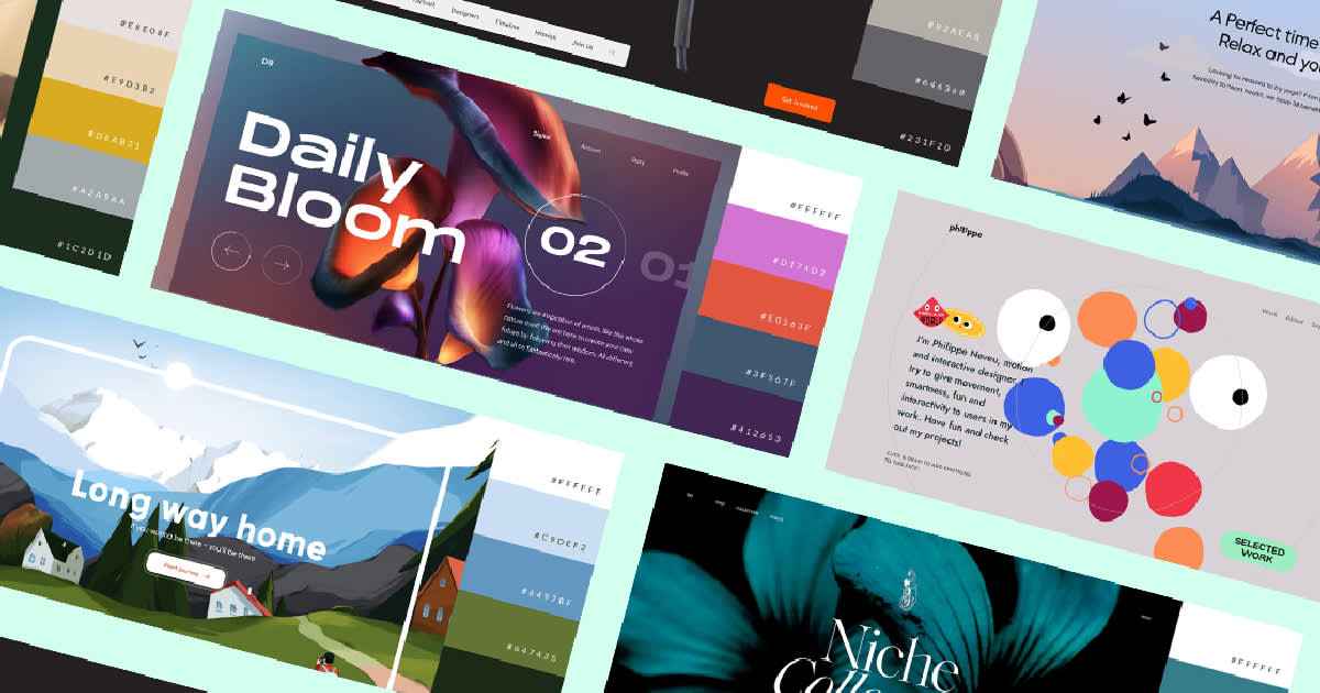
Top 10 Color Combinations That Will Make Your Website Stand Out
When it comes to designing a website, color combinations play a crucial role in creating an eye-catching and memorable user experience. Here are the top 10 color combinations that will ensure your website stands out:
- Blue and Orange: This vibrant pairing conveys energy and trustworthiness.
- Green and Yellow: Perfect for eco-friendly brands, this combination symbolizes growth and positivity.
- Purple and Gold: A luxurious mix that adds a touch of sophistication.
- Red and White: Ideal for food-related websites, this combo stimulates appetite and clarity.
- Black and Teal: A modern juxtaposition that conveys elegance and creativity.
- Pink and Grey: Soft yet stylish, great for beauty or fashion sites.
- Brown and Cream: This earthy combo is perfect for artisanal or rustic brands.
- Light Blue and White: Provides a fresh and clean look, ideal for health or wellness sites.
- Coral and Navy: A perfect balance of warmth and professionalism, great for corporate sites.
- Turquoise and Charcoal: A bold choice that combines vibrancy with depth.
Choosing the right color combinations is essential not only for aesthetics but also for conveying your brand's message and values. By implementing these top 10 color combinations, you can create a distinctive visual identity that captures the attention of your audience. Remember, the right colors evoke emotions and set the tone for your website, so take the time to experiment and find the perfect fit for your brand.
Is Your Website Color Scheme Hurting User Experience? Here's How to Fix It
The color scheme of your website plays a crucial role in shaping the overall user experience. Poor choice of colors can lead to visual clutter, making it difficult for visitors to navigate your site and absorb your content. For instance, overwhelming combinations of bright colors can be distracting, while low-contrast text can strain the eyes and lead to frustration. To enhance usability, consider employing a harmonious palette that aligns with your brand identity while ensuring readability. Tools like Adobe Color or Coolors can help you find complementary colors that work well together.
To fix issues related to your website's color scheme, start by conducting a thorough assessment. Ask yourself: Is the text easily readable against the background? Does the color scheme evoke the right emotions associated with your brand? Consider testing different color combinations through A/B testing to see which resonates best with your audience. Additionally, prioritize accessibility by adhering to web content accessibility guidelines (WCAG). Utilizing colors that are friendly for those with color blindness, for instance, can greatly improve user experience for all users.